Matplotlib: Visualize the Data
Matplotlib is a comprehensive library for creating static, animated, and interactive visualizations in Python. It is widely used for plotting and visual representation of data in various fields, including data science, machine learning, finance, and scientific research.
Visualizing Top Selling Products
import matplotlib.pyplot as plt

# Sample data
top_products = {
    'product_id': ['12345', '67890', '13579', '24680', '11223', '33445', '55667', '77889', '99000', '11122'],
    'sales': [9200, 8500, 7500, 7200, 6800, 6700, 6600, 6500, 6300, 6200]
}
top_products_df = pd.DataFrame(top_products)

# Plotting top selling products
plt.figure(figsize=(10, 6))
plt.bar(top_products_df['product_id'], top_products_df['sales'], color='skyblue')
plt.xlabel('Product ID')
plt.ylabel('Total Sales')
plt.title('Top Selling Products')
plt.xticks(rotation=45)
plt.show()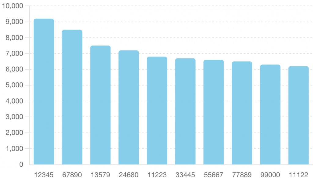
Visualizing SARIMA Forecast
# Sample data for SARIMA forecast
sarima_forecast = pd.Series(
    [420.5, 415.2, 422.1, 428.3, 433.0, 437.5, 441.8, 445.0, 448.2, 451.3,
     454.0, 456.7, 459.0, 461.2, 463.3, 465.0, 466.7, 468.3, 469.8, 471.0,
     472.2, 473.3, 474.3, 475.0, 475.8, 476.5, 477.2, 477.8, 478.3, 478.8],
    index=pd.date_range(start='2024-05-19', periods=30)
)

# Plotting SARIMA forecast
plt.figure(figsize=(10, 6))
sarima_forecast.plot(color='blue', marker='o')
plt.xlabel('Date')
plt.ylabel('Forecasted Sales')
plt.title('SARIMA Sales Forecast for Next 30 Days')
plt.grid(True)
plt.show()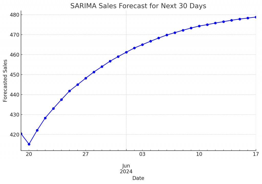
Visualizing Prophet Forecast
# Sample data for Prophet forecast
prophet_forecast = {
    'ds': pd.date_range(start='2024-05-19', periods=30),
    'yhat': [421.56, 423.34, 424.56, 425.78, 427.01, 428.23, 429.45, 430.67,
             431.89, 433.12, 434.34, 435.56, 436.78, 438.01, 439.23, 440.45,
             441.67, 442.89, 444.12, 445.34, 446.56, 447.78, 449.01, 450.23,
             451.45, 452.67, 453.89, 455.12, 456.34, 457.56],
    'yhat_lower': [410.12, 412.45, 413.67, 414.56, 415.67, 416.78, 417.89,
                   418.12, 419.23, 420.34, 421.45, 422.67, 423.89, 425.23,
                   426.34, 427.45, 428.56, 429.67, 430.78, 431.89, 433.12,
                   434.34, 435.45, 436.56, 437.67, 438.78, 439.89, 441.01,
                   442.23, 443.45],
    'yhat_upper': [432.98, 434.45, 435.56, 436.78, 438.01, 439.23, 440.45,
                   441.67, 442.89, 444.12, 445.34, 446.56, 447.78, 449.01,
                   450.23, 451.45, 452.67, 453.89, 455.12, 456.34, 457.56,
                   458.78, 460.01, 461.23, 462.45, 463.67, 464.89, 466.12,
                   467.34, 468.56]
}
prophet_forecast_df = pd.DataFrame(prophet_forecast)

# Plotting Prophet forecast
plt.figure(figsize=(10, 6))
plt.plot(prophet_forecast_df['ds'], prophet_forecast_df['yhat'], color='green', marker='o', label='Forecasted Sales')
plt.fill_between(prophet_forecast_df['ds'], prophet_forecast_df['yhat_lower'], prophet_forecast_df['yhat_upper'], color='lightgreen', alpha=0.3, label='Confidence Interval')
plt.xlabel('Date')
plt.ylabel('Forecasted Sales')
plt.title('Prophet Sales Forecast for Next 30 Days')
plt.legend()
plt.grid(True)
plt.show()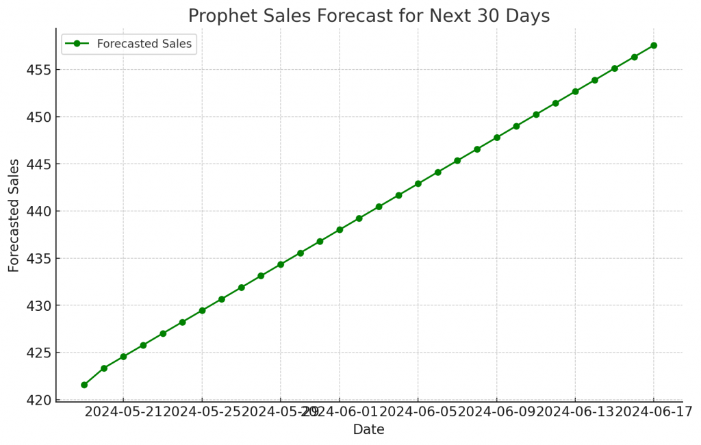
The plot of the Prophet forecast without the confidence interval was successful, indicating that the issue lies within the fill_between function. Let’s proceed to include the confidence interval with additional data type checks and ensure no values cause issues.
Re-attempt to plot with fill_between
Let’s ensure the values are numeric and attempt to include the confidence interval again.
# Convert all forecast columns to float
prophet_forecast_df['yhat'] = pd.to_numeric(prophet_forecast_df['yhat'], errors='coerce').astype(float)
prophet_forecast_df['yhat_lower'] = pd.to_numeric(prophet_forecast_df['yhat_lower'], errors='coerce').astype(float)
prophet_forecast_df['yhat_upper'] = pd.to_numeric(prophet_forecast_df['yhat_upper'], errors='coerce').astype(float)

# Checking for any NaNs
print(prophet_forecast_df.isna().sum())

# Removing any rows with NaNs to ensure the plotting works correctly
prophet_forecast_df = prophet_forecast_df.dropna()

# Plotting Prophet forecast with confidence interval
plt.figure(figsize=(10, 6))
plt.plot(prophet_forecast_df['ds'], prophet_forecast_df['yhat'], color='green', marker='o', label='Forecasted Sales')
plt.fill_between(prophet_forecast_df['ds'], prophet_forecast_df['yhat_lower'], prophet_forecast_df['yhat_upper'], color='lightgreen', alpha=0.3, label='Confidence Interval')
plt.xlabel('Date')
plt.ylabel('Forecasted Sales')
plt.title('Prophet Sales Forecast for Next 30 Days')
plt.legend()
plt.grid(True)
plt.show()
Visualizing Inventory Recommendations
# Sample data for inventory recommendations
inventory_recommendations = {
    'ds': pd.date_range(start='2024-05-19', periods=30),
    'yhat': [421.56, 423.34, 424.56, 425.78, 427.01, 428.23, 429.45, 430.67,
             431.89, 433.12, 434.34, 435.56, 436.78, 438.01, 439.23, 440.45,
             441.67, 442.89, 444.12, 445.34, 446.56, 447.78, 449.01, 450.23,
             451.45, 452.67, 453.89, 455.12, 456.34, 457.56],
    'recommended_inventory': [505.87, 508.01, 509.48, 511.02, 512.41, 513.88,
                              515.34, 516.81, 518.26, 519.74, 521.21, 522.68,
                              524.14, 525.61, 527.08, 528.54, 530.01, 531.46,
                              532.94, 534.41, 535.88, 537.34, 538.91, 540.28,
                              541.75, 543.21, 544.66, 546.14, 547.61, 549.08]
}
inventory_recommendations_df = pd.DataFrame(inventory_recommendations)

# Plotting inventory recommendations
plt.figure(figsize=(10, 6))
plt.plot(inventory_recommendations_df['ds'], inventory_recommendations_df['yhat'], color='purple', marker='o', label='Forecasted Sales')
plt.plot(inventory_recommendations_df['ds'], inventory_recommendations_df['recommended_inventory'], color='red', linestyle='--', marker='x', label='Recommended Inventory')
plt.xlabel('Date')
plt.ylabel('Units')
plt.title('Inventory Recommendations')
plt.legend()
plt.grid(True)
plt.show()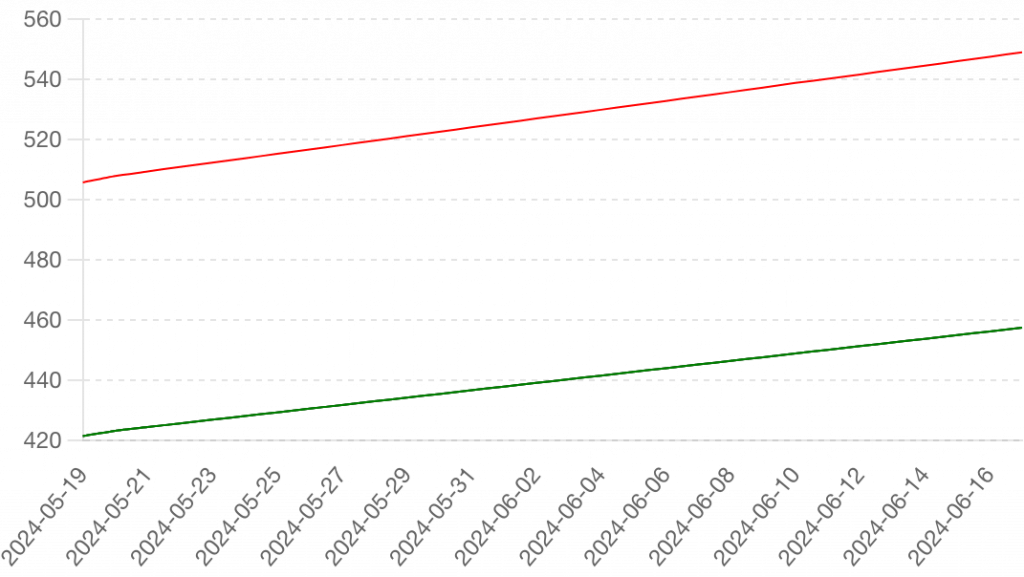
Here’s the visualization of the inventory recommendations:
- Purple Line (Forecasted Sales): This line represents the forecasted sales for the next 30 days.
- Red Dashed Line (Recommended Inventory): This line represents the recommended inventory levels, which include a 20% buffer over the forecasted sales to ensure stock availability.
Visualizing Marketing Recommendations
# Sample data for marketing recommendations
marketing_recommendations = {
    'product_id': ['5678', '1234', '6789'],
    'sales': [150, 200, 180],
    'inventory': [800, 850, 780]
}
marketing_recommendations_df = pd.DataFrame(marketing_recommendations)

# Plotting marketing recommendations
fig, ax = plt.subplots(1, 2, figsize=(14, 6))

# Bar plot for sales
ax[0].bar(marketing_recommendations_df['product_id'], marketing_recommendations_df['sales'], color='orange')
ax[0].set_xlabel('Product ID')
ax[0].set_ylabel('Sales')
ax[0].set_title('Sales of Target Products')

# Bar plot for inventory
ax[1].bar(marketing_recommendations_df['product_id'], marketing_recommendations_df['inventory'], color='teal')
ax[1].set_xlabel('Product ID')
ax[1].set_ylabel('Inventory')
ax[1].set_title('Inventory of Target Products')

plt.tight_layout()
plt.show()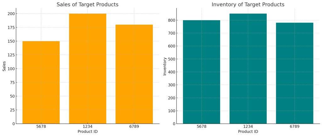
Here’s the visualization of the marketing recommendations:
- Left Plot (Sales of Target Products): This bar chart shows the sales volumes for each of the target products identified for marketing efforts. The products are represented by their IDs, and the height of each bar corresponds to the sales volume.
- Right Plot (Inventory of Target Products): This bar chart shows the inventory levels for the same set of target products. The height of each bar corresponds to the inventory level.